
Tutorial realized by ARTUNIVERSE (Antoine Dacheville)
Hello, we will discover in this new photo tutorial how to make a Spiderman drawing in the realistic style. This tutorial is related to the previous one, concerning the grey gradient with the GRAPHIT Brush range. So don’t hesitate to take a look at it beforehand.
Realistic drawing is what I prefer to work on. Not only because it takes a lot of time but also because it is a drawing style that requires a lot of techniques. We will detail them in a progressive way throughout this tutorial. To your markers!
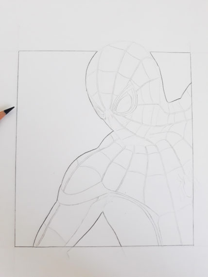
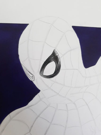
The first thing to do is to use a pencil. I use a 0.5mm steel criterium to simply contour my Spiderman. I imagine my face, the posture of the arms and body. I take care to have a light trace so that I can erase without difficulty if necessary. I also trace the positioning of the eyes. Take your time to do the pencil. This is a very important step before starting inking and coloring.
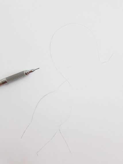
Once I know pretty much how my Spidey is going to be, I make a first sketch of the eyes. Again, I use a light layout because I know I will have to work on this area later.
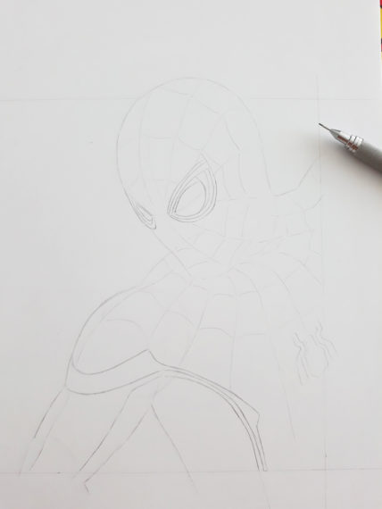
I also decide (as usual), to make a frame around the character. There are several reasons for this choice: 1- I easily define the area to color, 2- it allows me to make a background and dress my drawing, 3- making a background allows me to highlight the white of the drawing and thus to appear more real.
TIP: To make a frame that does not “crush” your character, highlight areas like Spiderman’s head protruding from the background. It also gives perspective.
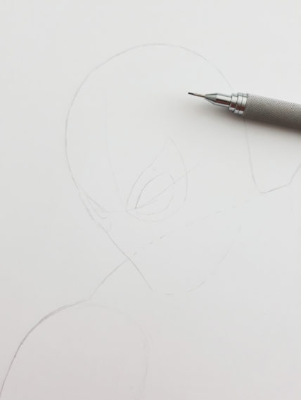
Then we can start working on the first details of the costume. I start with the eyes, which in the film are expressive and can move. It is therefore necessary to mark this “technology” with features like this. We will give it some relief later.
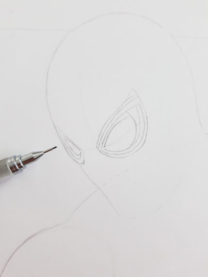
Now comes the most delicate step of the pencil: to make the features of the costume. They must not be straight because it is necessary to give an impression of volume. So make a first line and then move forward gradually until you have finished the vertical lines. Once that is done, we can do the horizontal ones.
NOTE: What differentiates Spiderman Homecoming’s costume from others (Spiderman of 2002, The Amazing Spiderman…) is that the horizontal lines are more spaced from each other. So remember not to want to do too much. The ideal is to stay in what is called “accurate”, i.e. as close as possible to the version of the film.
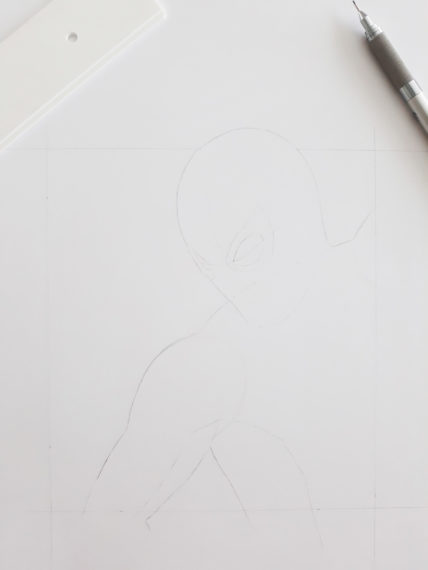
Still to remain faithful to the film, it is then necessary to split the vertical lines, like this.
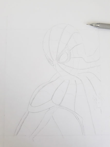
You can then go back by pushing a little more on the horizontal lines.
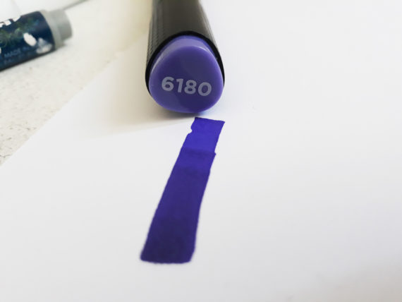
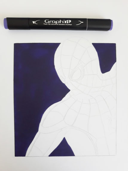
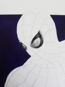
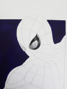
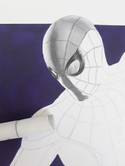
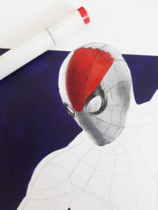
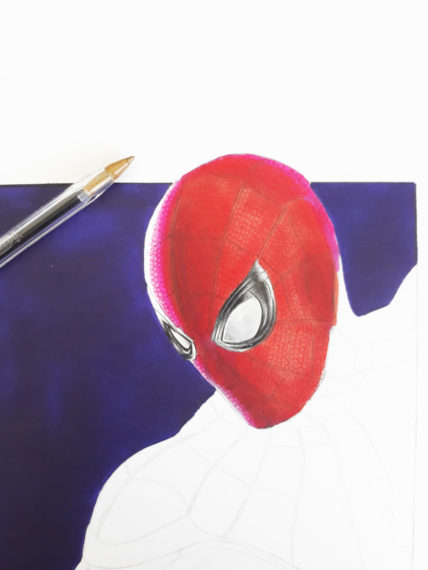
We will now work on the background. I chose to color my background with a dark purple 6180 with a marker from the MARKERS range. This choice of marker is explained by its rectangular tip which will facilitate my passage around the frame of my bottom. So I will have a straight line.
I start by inking only the outside of my Spiderman and the outline of my background, in order to delimit my area to color.
Then I color by taking care not to overtake on our character. Have a confident line and take your time.
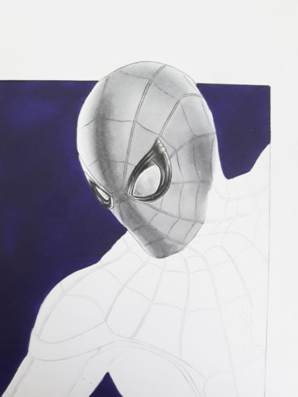
Then I can actually attack the Spiderman. I start with the eyes by simply inking the lines of my pencil.
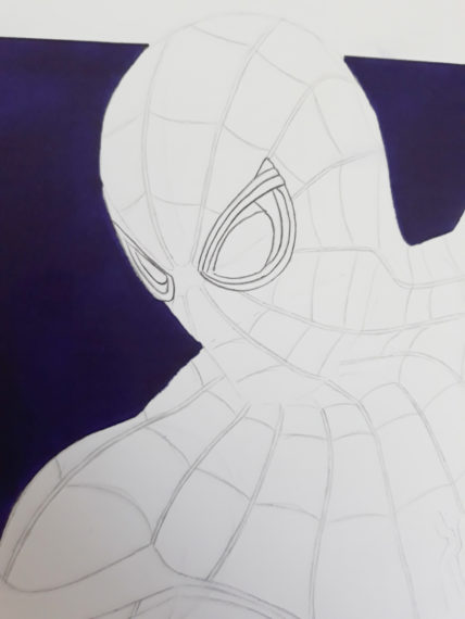
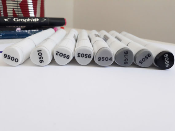
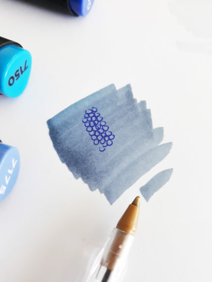
I will colour my eyes with the Neutral Grey BRUSH range in order to have an extra fine tip for short shades.
As for the tutorial on gradient in grey tone http://www.graphit-marker.com/blog/tutoriel-degrade-de-gris/, I start with the darkest area and go to the lightest area. I use the extra fine tip throughout the process.
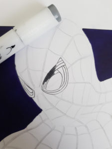
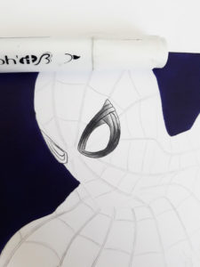
Once I have a visual of my gradient, I go further with the black.
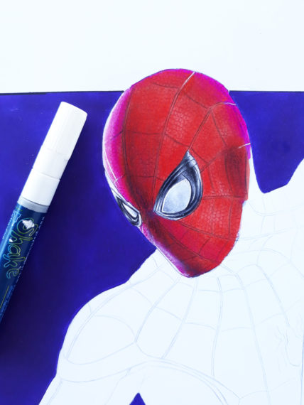
I end up giving relief by passing slightly with a white GRAPH’IT SHAKE 0.7mm.
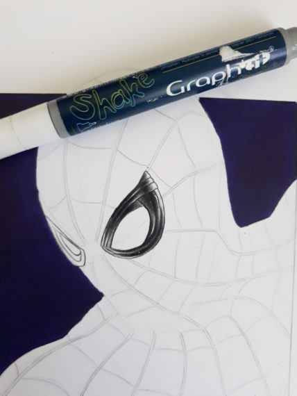
Finally, I also colour the inside of the eyes with the brush tip using the 9500, 9501 and 9502. I keep in mind my contrast zone to be consistent with the play of light. I do the same for the right eye.
Then it’s time to move on to the costume. I start by inking my “web” features of the costume.
I apply the same “rule” for my grayscale.
I will use 4 markers to get a pink relief by grading from red to pink.
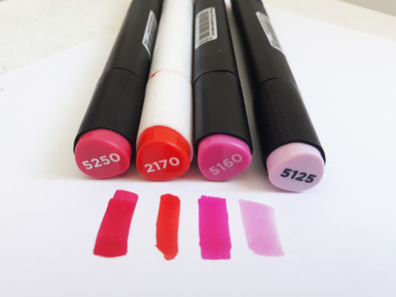
Of course, you can do without reflection and in this case use only 5250 and 2170.
I associate the 5250 with the darkest areas, and the 2170 with the lightest areas. Here is an example on the top of the mask:
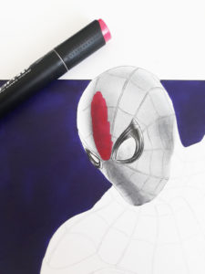
To make the pink reflection, I go back to the outermost corner of the mask with first the 5160 and then the 5125.
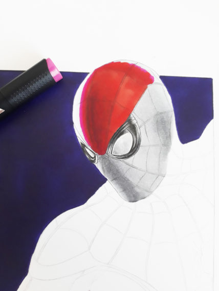
In this last picture, you can see that I voluntarily leave a white area on the mask. We find here our play of light with a gradient going up to white through a pink reflection. I’ll do the same thing on the whole right side of Spiderman.
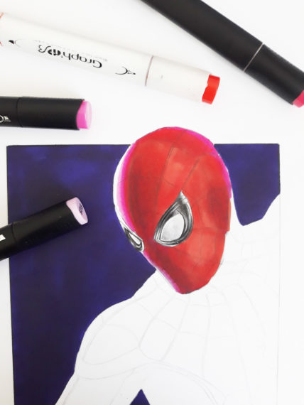
Let’s get down to details! To give texture to this costume design (Homecoming style), I choose to make small, tight circles using a red BIC. Here’s the idea:
This is a very long but very important step, especially to obtain a realistic rendering. I do these details on the mask and also on the whole costume so… to your pens! This is the rendering:
Then, I complete the shades of my mask by adding a little more grey over red and also an addition of white with the 0.7mm SHAKE.
NOTE: Remember that white is crucial for your drawing to be realistic. That’s why I like to make important contrasts, especially on Spiderman’s right side.
I’m taking back everything we did before with the suit.
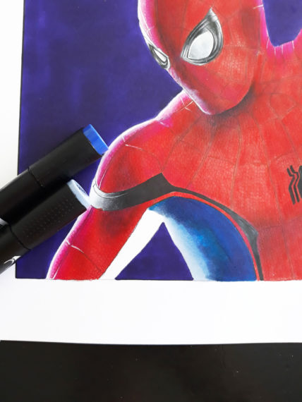
I also do the same black/grey gradient technique as for the eyes with the black parts of the suit, as here with the black part of the shoulder.
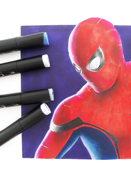
We can move on to the last part with the blue part of the suit. Here are the markers I will use:
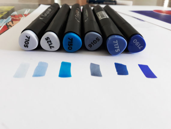
I start by coloring a first base at 7150.
Then I complete with the 7125 and 7105.
I then take back the whole of my gradient using the same markers but leaving with a darker marker, the 7175.
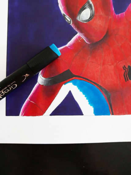
I colour until I get a good mix of colours among them.
Then, I apply the same type of details as for the red part, i.e. with circles but with the blue BIC this time.
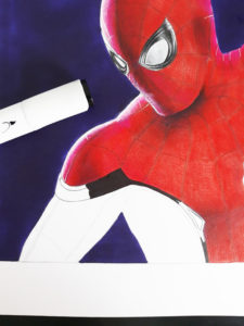
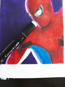
Finally, I add white details with the SHAKE.
TIP: You can tap with your finger once you have made a point with the white SHAKE. It will blur the white and blend it into the blue.
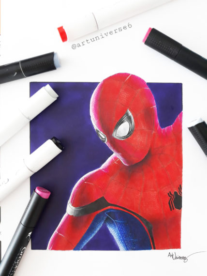
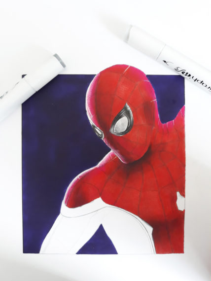
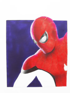
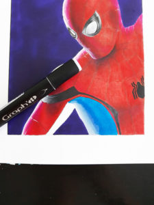
Here is the final picture of my drawing of Spiderman:
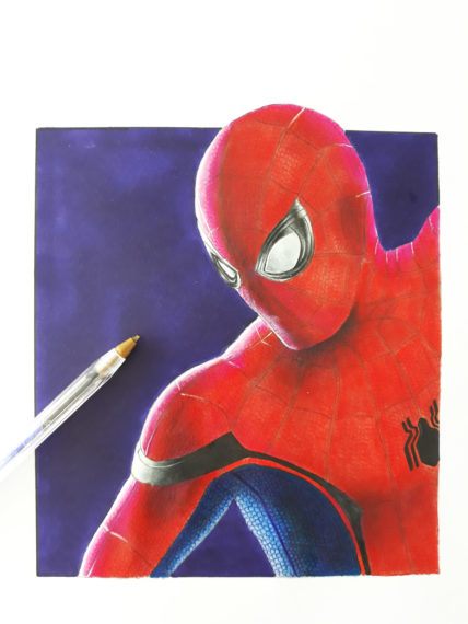
It took me about 10 hours to do it, on A4 Bristol paper.
We have therefore seen through this tutorial different techniques to create relief, depth and textures for a realistic result. I illustrated the realistic drawing with Spiderman but each character has a different technique, because the costumes are not the same (different details, textures…) but concerning the color gradient you will always find the same base.
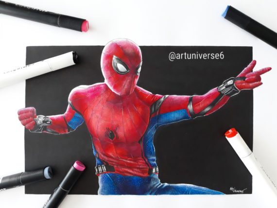
Here is another work, done with the same techniques as above, on a 50x65cm format with 36 hours of drawing.
Good luck with your drawing!
No comments yet. You should be kind and add one!
By submitting a comment you grant Graph'it Marker a perpetual license to reproduce your words and name/web site in attribution. Inappropriate and irrelevant comments will be removed at an admin’s discretion. Your email is used for verification purposes only, it will never be shared.