
Philippe Dessoly, a French illustrator working in the world of manga and comics, has prepared a tutorial on skin colouring in comics “style”.
… Made, of course, entirely with Graph’it alcohol markers.
Find new technical tutorials next month!
– – –
Hello everyone !
I’m going to show you how to colour the skin of a character in comic, comic strip or realist style.
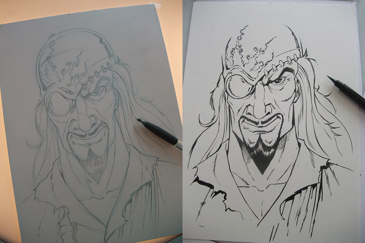
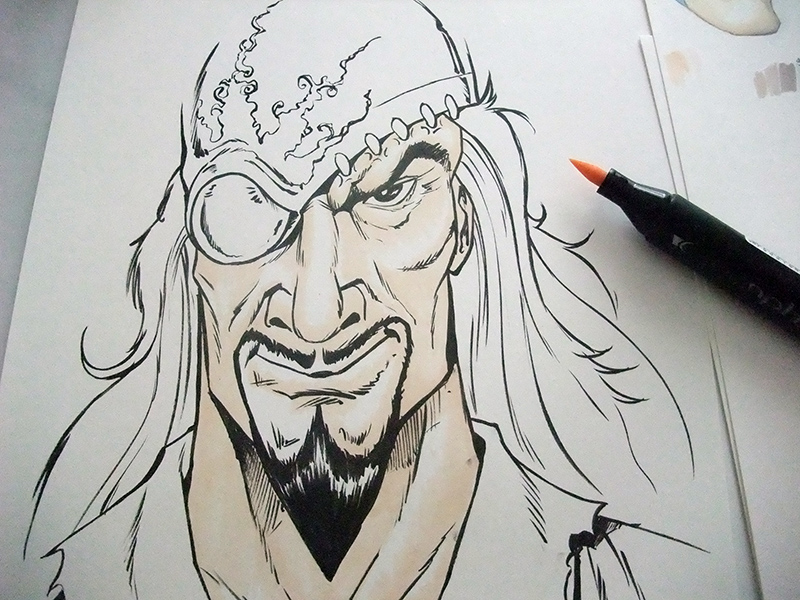
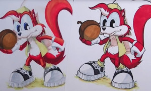
I will take as an example « El-dorado », one of my characters from the comic strip « Estrella Stempton ».
I start by cleaning my pencilled and then I ink with a liner brush tip.
Be careful to use a tool whose ink will hold up to the alcohol markers, otherwise the ink may drool on your sheet. Personally, I ink with a Brush, but you can use Liners Graph’it, which are adapted to alcohol markers.
Let it dry well before switching to alcohol inks.
Once the inking is finished, the question to ask yourself is: Which Graph’it Marker color will I use? »
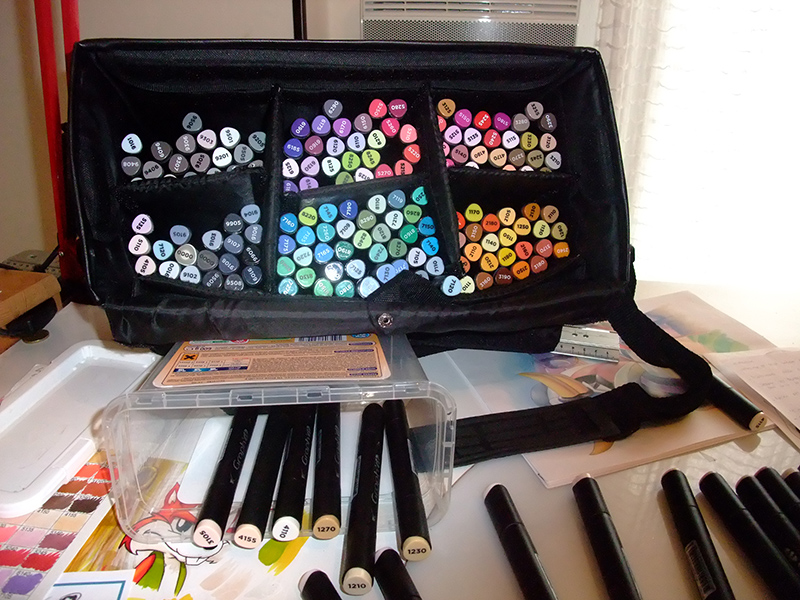
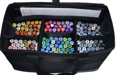
I have in my possession the case of 165 colors, so let’s say that the more colors there are, the more complicated the choice gets! 🙂
- The colour chart :
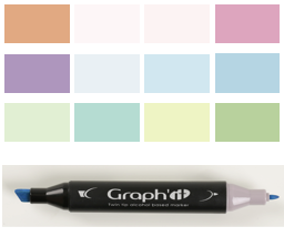
The first important step is to create a colour chart.
The tip I can give you is to make this colour chart on all papers you are used to working with.
Indeed, depending the type of paper, ink isn’t absorbed in the same way.
Moreover, according to your desire: work with bright colours, do rough or if you are looking for a more “watercolour” rendering… the choice of paper will not be the same. It is important to know that the colour rendering can vary according to the type of paper… hence the importance of colour charts for each type.
I made this colour chart on 200grdrawing paper , here is the result :
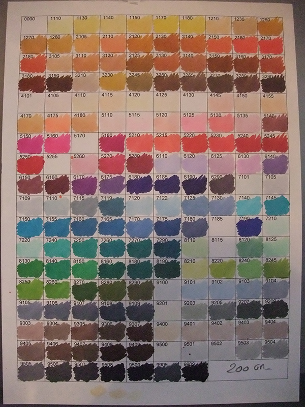
It allows to search for the colours we want to colour the skin.
After making a visual choice, I tested color groups.
Here is the result
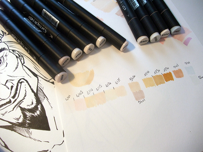
- The choice of colours:
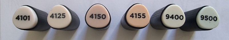
I chose in particular the 4000 range and a beginning of 9400.
By the way, remember to note the colors, we quickly forget which marker we used !
I then refine my choice a little more, which will give me the final choice of the markers numbers….
4101/ 9400 / 9500 / 4125 /4150 / 4155
Test the colour, do not rely only on the colour of the caps, which is certainly close, but not enough to know the real colour. Indeed, the result is totally different between the colorization of the plastic which is opaque on the cap and the transparency of the ink on the white paper.
Once this choice is defined, I start by making a quick test by drawing a little piece of face. It allows me to see how the colours behave between them.
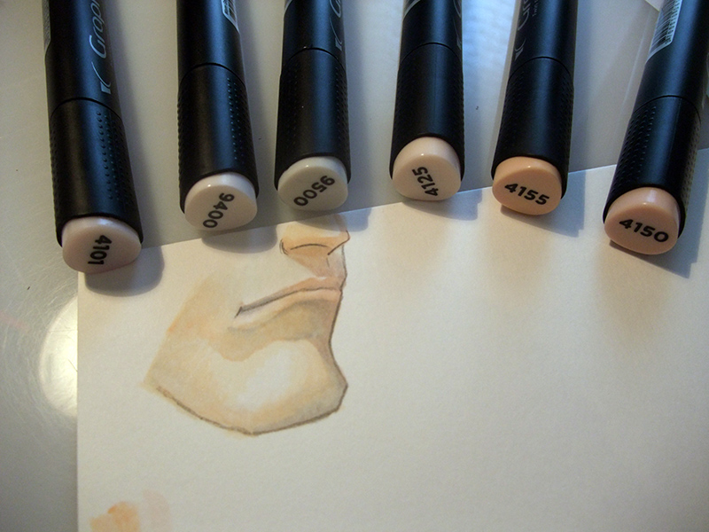
I’m still refining the choice of colors to get to the panel I’m looking for, which gives me 4 color groups:
1st group :
Lips and what can be a little pink : 4150/4105
2nd group :
Skin base : 4120/4125
3rd group :
Colour connection: 4101/9500
BE CAREFUL do not overuse the 9500 (neutral grey), because it ends up giving a green side through layers. On the other hand, it is practical to link the colors together.
4th groupe :
Shading : 9400/9402/9502/9503
For my part, I separate the markers according to the group, to avoid having to look for them.
- Tests and trials:
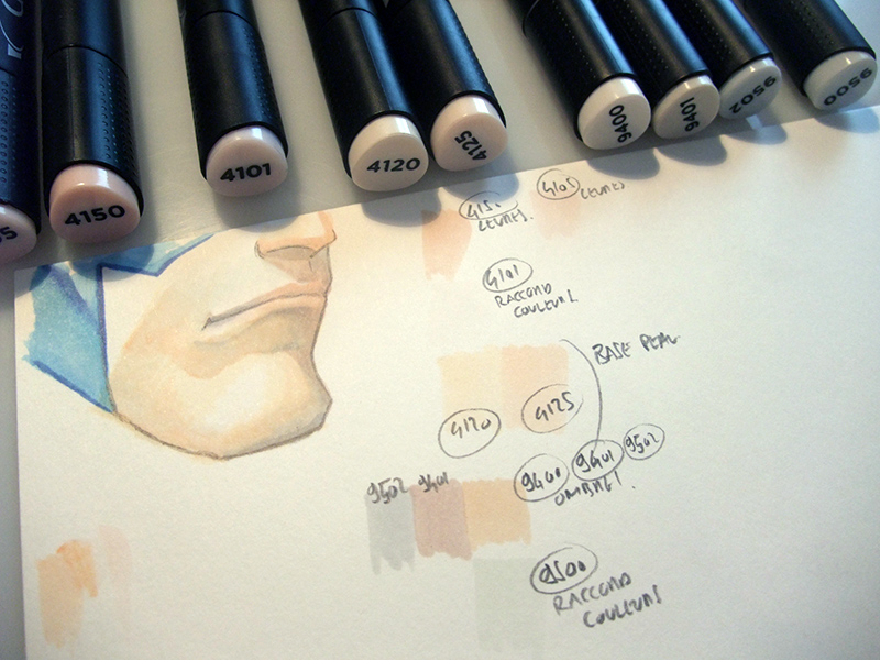
Remember to start by testing how the colours mix with each other. If you do it directly on your drawing, you may be surprised.
Here I made 2 tests, first with 4125 and 4120. I first applied a coat of 4120, then I came to apply 4125. The colours blend well together as you can see.
I also made a test with the 4125 and 4150. I used 4101 to mix colours, not as full colour
The important thing to remember is that it is the tones that count, not the colours. You can mix colours with similar tones without any problem. On the other hand, mixing different colours without paying attention to the tone is more risky!
So let’s started!
- Beginning of colorization
4.1. The base
So I start with my group 2 (skin base) 4120/4125.
It is better to start with the lightest colours, because if you start with the dark ones and you don’t like the look, it will be more difficult to go back.
A drawing that is too dark is difficult to catch up with, while a drawing that is too light can be darkened little by little.
You can use the colours of group 3 4101 and 9500 for the colour connections, which will allow different colours to be linked together.
For the lips, use colours 4150 et 4105.
You have to take it easy when you’re not used to it frequently. It is necessary to proceed layer by layer until the desired result is obtained. The advantage of Graph’it alcohol markers is that they overlap well. Depending on your paper you can do this without fear of the ink passing through. Layout paper is preferred by some because the ink does not pass through at all.
4.2. Strengthen – Shade
After using our Group 2 with a layer of 4120 and another of 4125, I score more and more with the 9400 of Group 4 which is very close to a skin color and I reinforce again with the 9402
BE CAREFUL there is a good gap between these 2 colors, even if they follow each other (There is only one color between 9400 and 9402)
Here is the result :
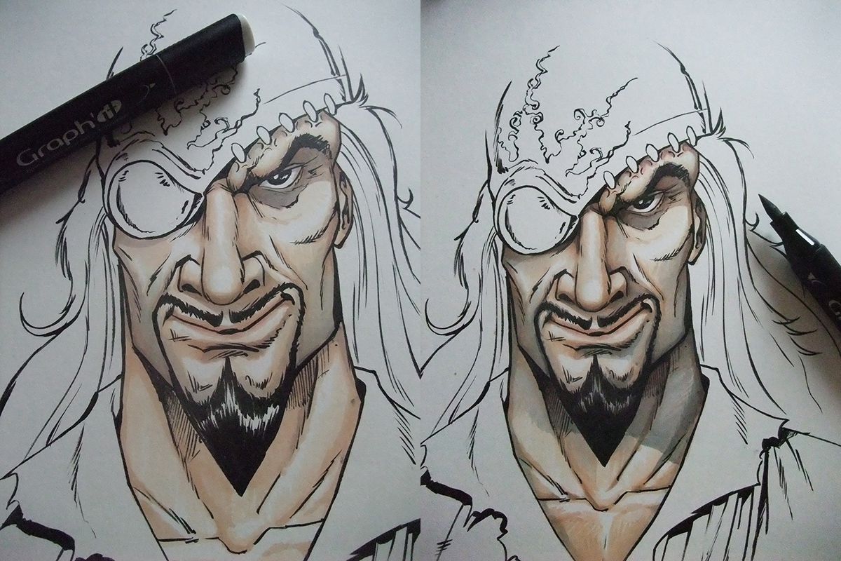
4.3. Refinement and contrast :
I work on shadows and skin color additions to support the colors more and so that it is not too “grey”. Overall I don’t want it to look too red or pink, I’m looking for a realistic tone.
Work by brushing the tip of the brush, you must be light, do not apply high pressure, in fact you must adapt to the paper.
Numbers 9502 and 9503 work well for the unshaven beard effect
![]()
In comparison, the 9400 range has more a skin tone, the grey is quite “warm”.
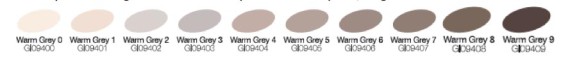
Greys generally go well with skin colours, in addition to giving volume.
The other interest of the greys is that they are used to create new colors, yes, but we will probably come back to it in another tutorial.
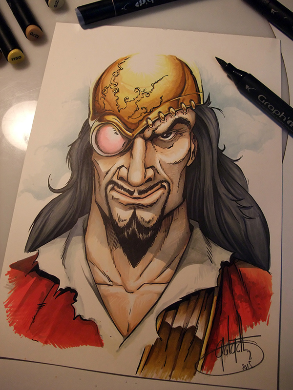
And here is the final result !
Here I hope that this tutorial has been useful to you and may have helped you on some points.
Feel free to leave a comment or ask a question, I will be happy to answer it.
See you soon for future adventures!
Philippe Dessoly
To learn more about Philippe Dessoly and to find all his creations, here is his site and his Facebook page:
www.facebook.com/philippe.dessoly.7
http://www.golgoth71arts.com/
New tutorials will be proposed soon
6 comments
Bravo et merci pour ce tutorial très précis !
bonjour, je débute dans la colorisation et en faisant ma première colo je trouve que le résultat ne me plait pas, je trouve que je n’arrive pas à bien mélanger les couleurs.
S’il vous plait, avez vous des conseils d’utilisations.
Bonjour,
Pour acquérir une vraie technique de colorisation, il faut de l’entrainement. Il n’y a que par l’entrainement que vous deviendrez habile pour les dégradés et mélanges.
Il existe aussi de nombreuses vidéos ou tutoriels qui expliquent les techniques.
Nous allons d’ailleurs poster un tutoriel sur les dégradés (et des conseils sur les mélanges de couleurs) en fin de semaine. Surveillez la page “tutorials”
Pour pouvoir mélanger des couleurs, il faut déjà bien les choisir à la base (prendre des couleurs proches), il faut dégrader vos couleurs avec la plus claire…
Par ailleurs, le blendeur est un très bon moyen pour les mélanges de couleurs.
Mais le tutoriel vous expliquera cela très bien! 😉
Super tuto!!! J’ai beaucoup appris merci .
Mais je rencontre un petit soucis quand j’ai une grande surface à colorier dés que j’utilise la pointe biseau je n’ai pas de résultat uniforme , avez vous un conseil à me donner ?
Merci.
Bonjour,
Vous pouvez contacter l’auteur du tuto sur sa page facebook, il donne beaucoup de conseils! En tant qu’illustrateur pro, il sera le plus à même de vous répondre.
Mais un premier conseil est de travailler très vite ! Et de s’entrainer car la technique vient à force d’essais
https://www.facebook.com/philippe.dessoly.7
Bons dessins!
bonjour olivier R.
j’ai eu le même problème récemment et on m’a dit que les graph’it en fond sur une grande surface ce n’était pas top.
On m’a conseillé d’utilisée pour les fond de la pastel car en plus ça va très bien avec le graphh’it et je confirme, j’ai réussi grâce à de la pastel à embellir mon dessin comme jamais,j’en suis très fière maintenant je te conseilles d’utiliser ça pour tes fonds 😉
By submitting a comment you grant Graph'it Marker a perpetual license to reproduce your words and name/web site in attribution. Inappropriate and irrelevant comments will be removed at an admin’s discretion. Your email is used for verification purposes only, it will never be shared.