
Philippe Dessoly, a French illustrator working in the world of manga and comics, has prepared a new tutorial for you, this time on gradients with alcohol markers.
… Made, of course, entirely with Graph’it alcohol markers.
– – –
Hello everyone !
Today I will explain how to make gradients with Graph’it alcohol markers. It will also allow you to make beautiful metallic effects and other diverse and varied materials… that you will discover in a next tutorial !
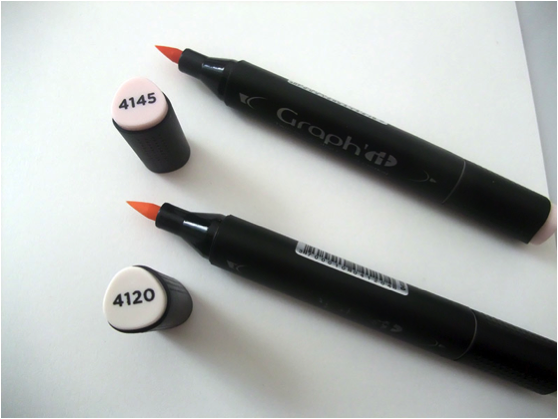
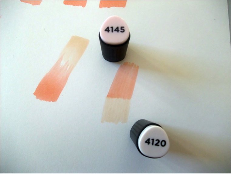
Let’s start with the basics of the technique with these 2 colors Graph’it Markers 4145 / 4120, on which I put the brush tip.
In fact, making a gradient is very silly, all you have to do is practice and practice a lot to achieve the result you want. It’s all about pressure on the felt and movement. Once you have acquired the gesture, you will no longer be aware of it, it will be done automatically.
-
Simple gradients
To draw a gradient it is better to go from bottom to top with the felt and have the highest pressure at the beginning of the line and not the opposite (fig A). This is the technique known as “full and untied”. Why? Why? Because the finest line will serve as a screening and binding agent for your gradient, as if you were interweaving a black and white screen to make grey.
The thicker your fine line, the harder it will be to blend your color. Going from the thickest to the thinnest you will accumulate more ink at the beginning than at the end of the line. So, naturally, the color will be less intense at the end of the line. It is also important that the movement is fast and safe, because the slower you go, the more colour will accumulate on the paper. I show you the result in pictures, it will be clearer:)
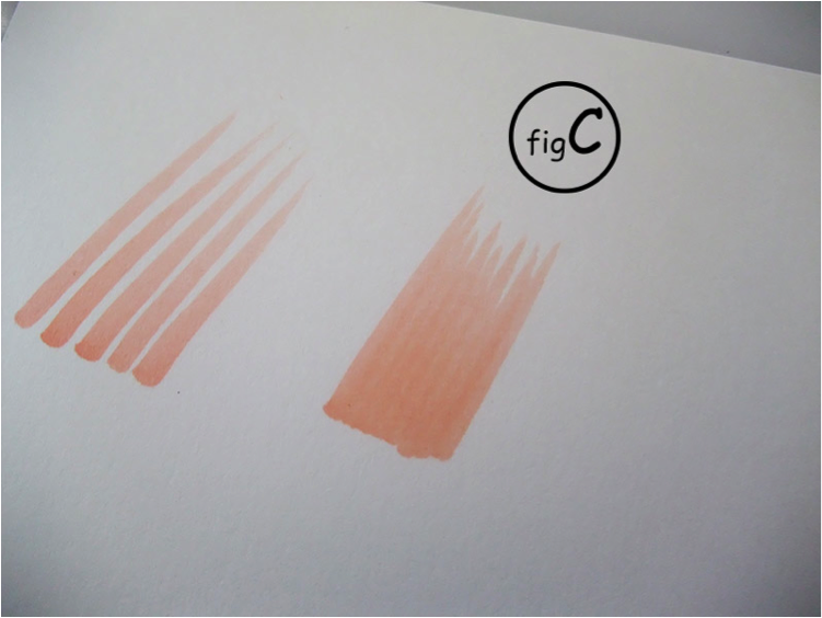
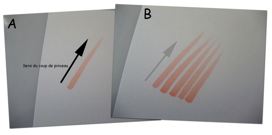 On this example I voluntarily spaced the lines (fig B). In reality, the same thing will have to be done, but making sure that the lines touch each other as in the test on the right (fig C).
Here, your first gradient is drawn:)
The simplest gradient that can be achieved is a gradient on the same color, simply by superimposing several layers of the same color on itself.
Here (fig D), the developed layers, once superimposed, give our gradation. You can put as many as you want.
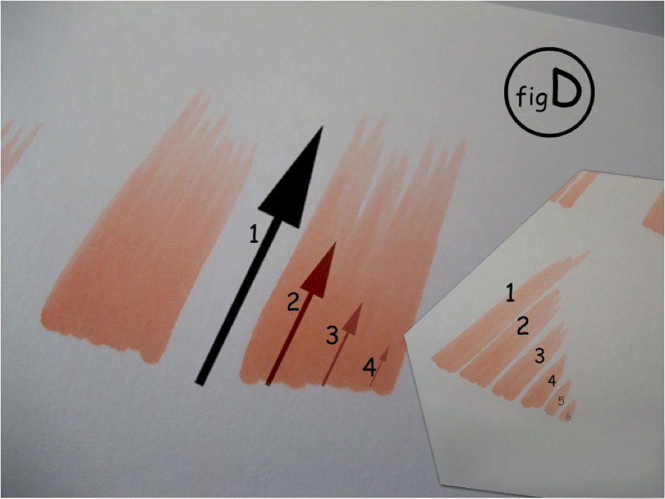
Here on (fig D) I have superimposed 4 layers of colors, always with the technique of “full and untied”. The more you overlay it, the more your gradient will be marked.
But, be careful!
The more layers you put on, the more ink will pass through the paper. Worse, the paper will no longer be able to absorb the layers and it will then start blistering!
Hence the great importance of choosing your paper, depending on what you want to draw.
To the right of the image I added the size of the brushstrokes I put, which, once superimposed, become our gradient (fig D).
Also be careful not to repeat too much on the “top” of the line with your alcohol marker (towards the top of the tip of the light line) (fig E), because it will make a color difference, a too important “superposition”, and therefore a difference in tone. You will then be forced to use the color layers again to blur the gradient. This will change the color you wanted at the beginning. It will no longer be light pink, but may become very dark (fig F).
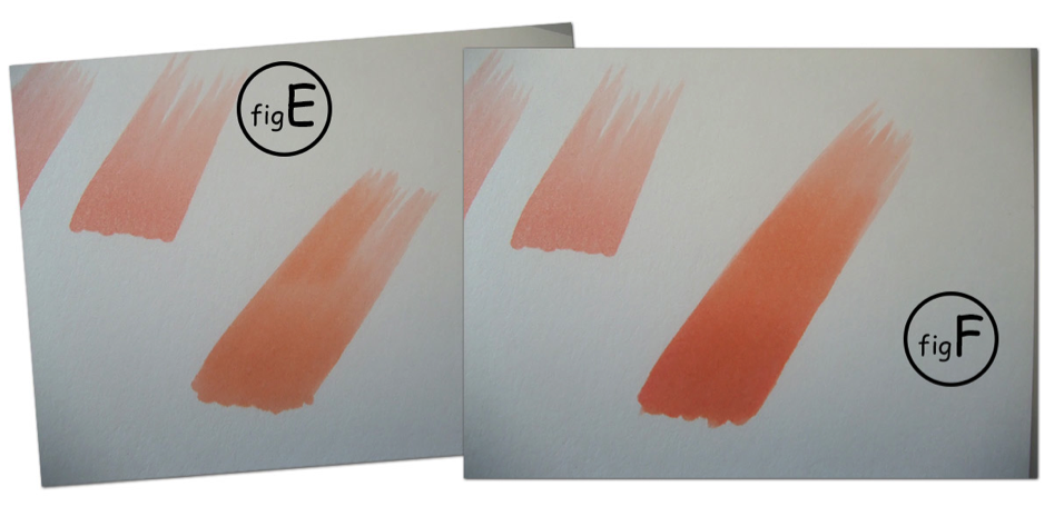 As you can see I had to put several layers of color back on to make up for the fact of going higher on the color with the felt.
Don’t hesitate to practice, that’s the only way you’ll get there! By doing different tests: by pressing more or less with the felt, with a more or less fast movement and of course with a more or less thick solid and loosened. Only in this way will you become familiar with the gradient technique.
Now let’s continue with something more complicated.
-
Gradient with 2 colours.
With colours 4145 / 4120
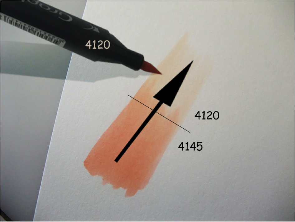
What you have to do when you make a gradient is to stretch from the darkest to the lightest color. For example, here, I will stretch the 4145 to 4120 using the lightest 4120 color.
La couleur la plus claire va servir de mélangeur et de liant entre les 2 couleurs. Voilà ce que ça donne (fig G).
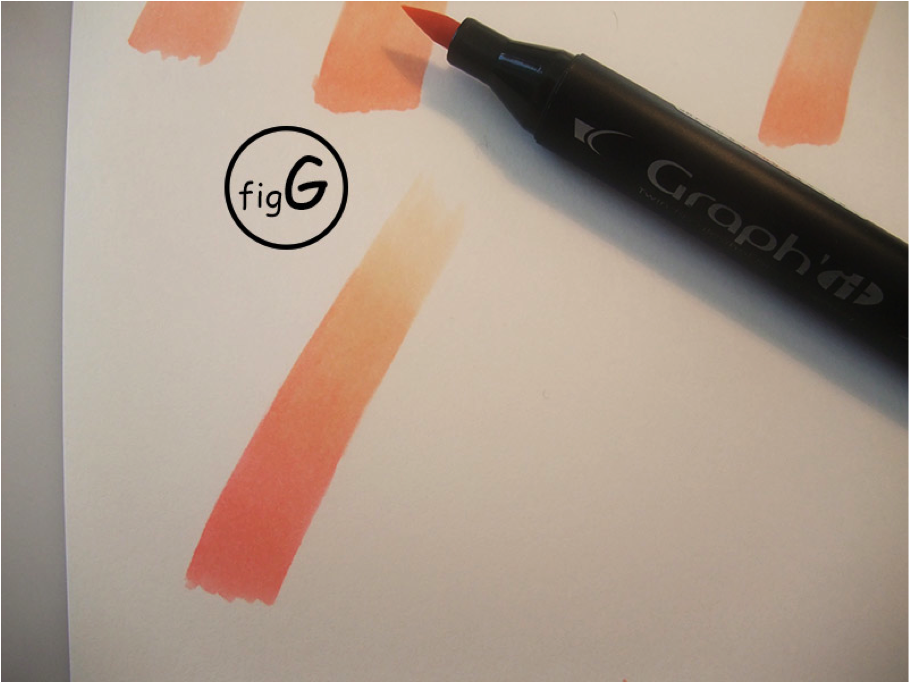
Do not hesitate to spread the 4120 well on the 4145 and stretch it well, a little like you would with paint.
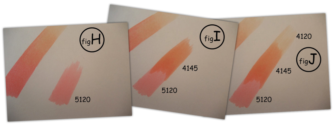
So far it doesn’t mix well. Well, like the example of the (fig G) we will stretch the colors together….
With the 4120, we will stretch the 4145 on the 4120 color (FIG J).
Still with the 4120 marker, we will stretch the color n°4145 that we put on the color n°5120, then we will come back to work with the 4145 marker on top.
It is really a blow to take, which is not necessarily easy to explain with text. Nothing beats training.
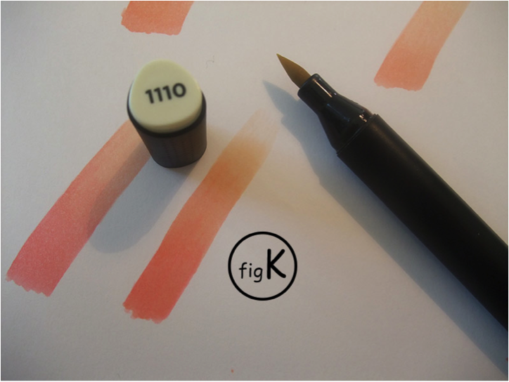
Which will give us a nice gradient like this one! (fig K) or (fig L, image 1)
Then everything is allowed. You can say to yourself: “Here, I would like a more orange or yellow shade”. No problem! No problem! For example, I take the color 1110 of the Graph’it (the lightest yellow) and I apply a layer over the entire gradient, which will give us image 2 of the (fig L).
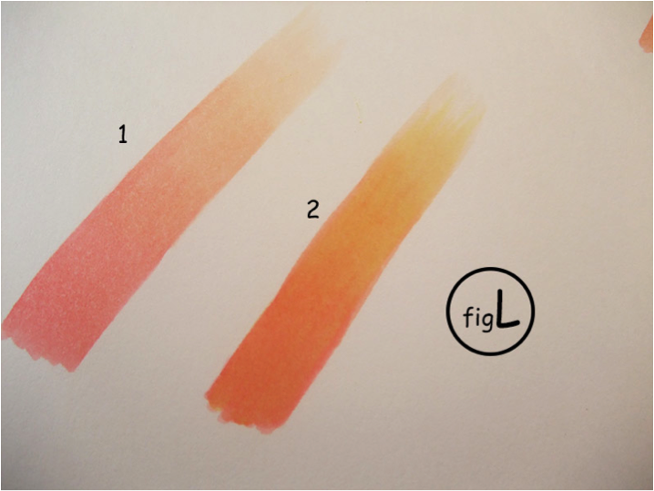
We can immediately see that gradient 2 has become more “yellow” and warmer than gradient 1.
And so on with any color….
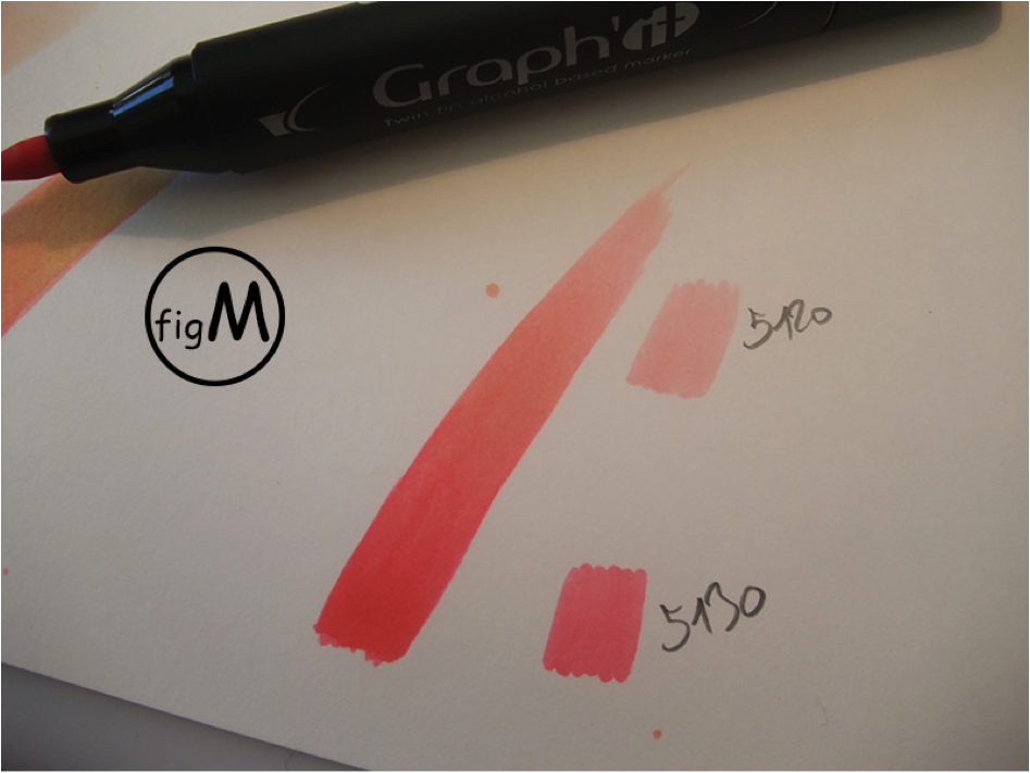
Another example of gradation between colours N° 5130 and 5120 (fig M).
-
Tip for catching up on a spot
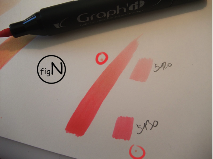
As you can see I did 2 small spots on the image, surrounded in red (fig N).
For this kind of small spot, don’t panic!
If it is on a drawing, you have to play with it and integrate it.
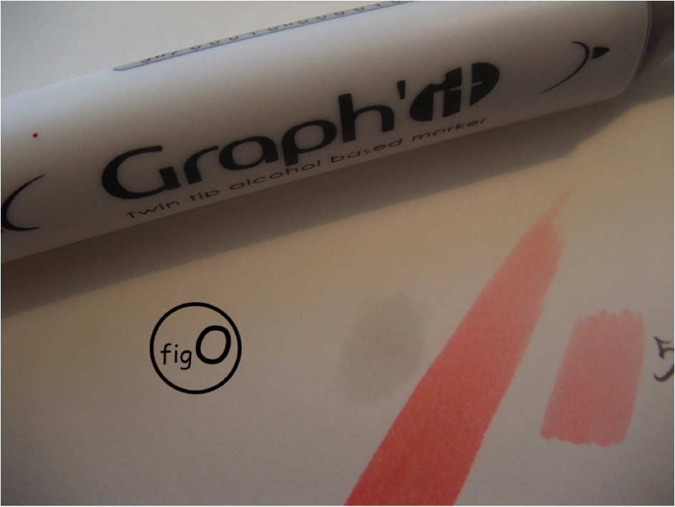
If like here, it is on paper, just use the Blender Graph’it to make it disappear! We pass the Blender mine until the spot is blurred. Depending on the spot or colour, it may be necessary to do this twice, allowing it to dry well between the 2 applications (fig O). To check if it is dry, look at the drawing by transparency in light, if it is not dry, you will see a translucent stain due to alcohol.
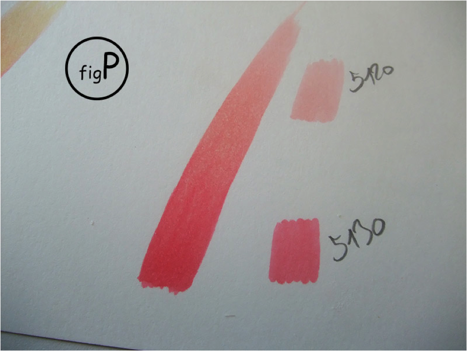
And here is the result:) more tasks! (fig P)
-
A little practical exercise!
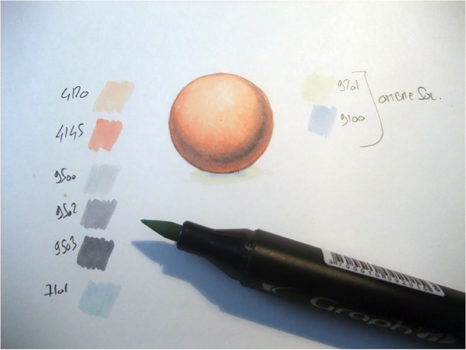
Let’s create a sphere
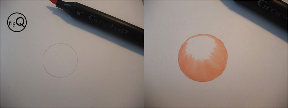
We will apply what we saw above to create a sphere.
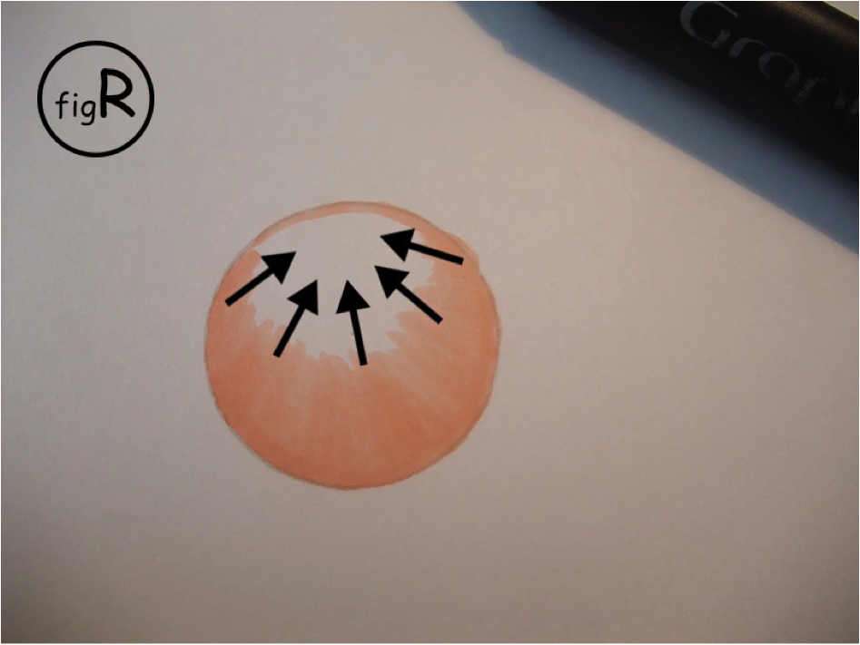
The trick is that you have to follow the drawing when you brush. That is, orient the direction of your brushstrokes according to the shape to be painted, as in the image (fig R). Let’s start with color No. 4145….
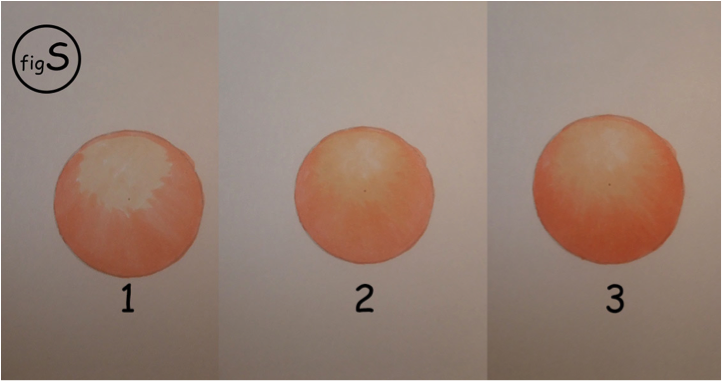
Then we will apply the color No. 4120
On (fig S) sphere 1, I apply the 4120. Then on sphere 2, I do as mentioned above in the tutorial: I stretch the color 4145 until I get a good mix of colors. Finally, I come to raise the sphere by the color 4145 to mark a little the volume.
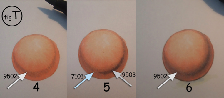
(fig T) I mark the volume even more with the color 9502 (image 4). I continue with 7101 (image 5) to mix and refine the color. I add 9503 to mark the contrast (image 5), with a little 9502, I blur the too sharp and very dark lines of the 9503 so that the colors blend together more (image 6)
And here is the final result….
Don’t forget, there are many ways to make gradients: depending on the shape of the image, the surface to color, the effect you want to give etc….
We can degrade: either as I just showed you, or in a zigzag, or by small brush strokes for the parts that require precision…
So, since nothing can replace your own experience, the secret is to do tests, tests and more tests!
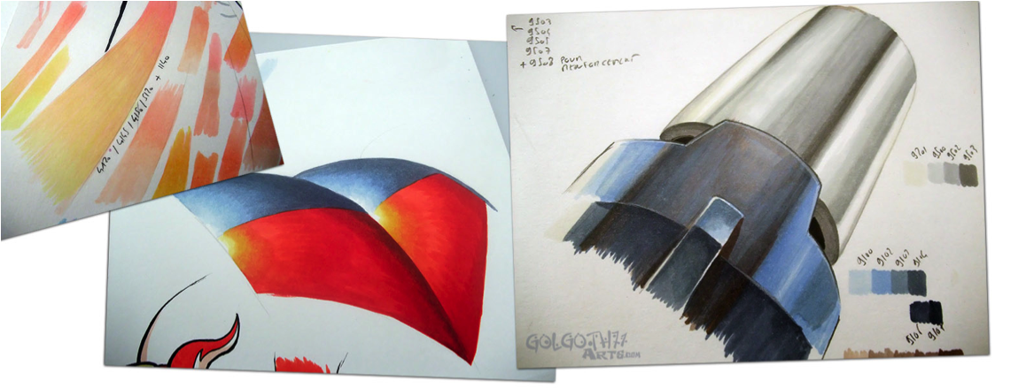
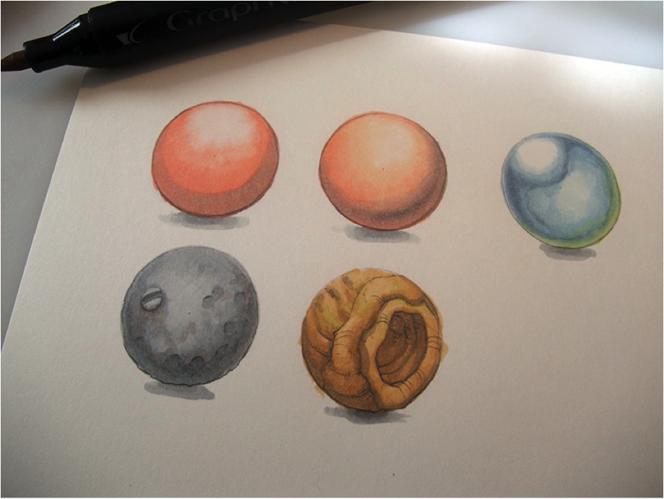
I hope this tutorial has helped you. It will serve as a basis for the next ones which will concern the creation, always using alcohol markers, of metallic effects or textures, of which here is an example:
So see you soon for more tutorials!
Philippe
—
To learn more about Philippe Dessoly and to find all his creations, here is his site and his Facebook page:
www.facebook.com/philippe.dessoly.7
http://www.golgoth71arts.com/
—
If you liked this tutorial, you can also find a tutorial on skin colorization:
Tutoriel technique 1 : Comment coloriser la peau – « style comics » – marqueurs à alcool
5 comments
Je ne l’ai pas encore testé mais je le trouve bien expliqué 🙂 En tous cas je le trouve très bien expliqué et j’ai tout suivi !
Philippe Dessoly a fait un super tutoriel !
Un prochain est en cours d’écriture, patience 😉
Je me rends compte que j’ai écrit un “expliqué” de trop lol = au second il faut lire en fait “détaillé” 😉 Merci Philippe Dessoly 😀 !!!
Super tuto !! Mais j’aimerais savoir, quel type de papier avez-vous utilisez pour faire vos dégradés ?
Bonjour
Généralement Philippe travaille sur du papier Schoellerschammer 200g matt
Vous pouvez suivre sa page facebook et lui poser la question!
https://www.facebook.com/philippe.dessoly.7
Cordialement
By submitting a comment you grant Graph'it Marker a perpetual license to reproduce your words and name/web site in attribution. Inappropriate and irrelevant comments will be removed at an admin’s discretion. Your email is used for verification purposes only, it will never be shared.